White Space
Xiaomi
mi.com

In this example we can see that white space is present through all the webpage. It gives enough space for the content to
"breathe" and makes the text more readable. It also draws the customer's attention to special spots on the page.
PARC: Contrast
Razer
razer.com

Just with the black background and the white letters it brings all the attention to the text, and if we add the notebook
images with vivid and vibrant colors. This exemplifies almost perfectly what Contrast means in web design.
PARC: Alignment
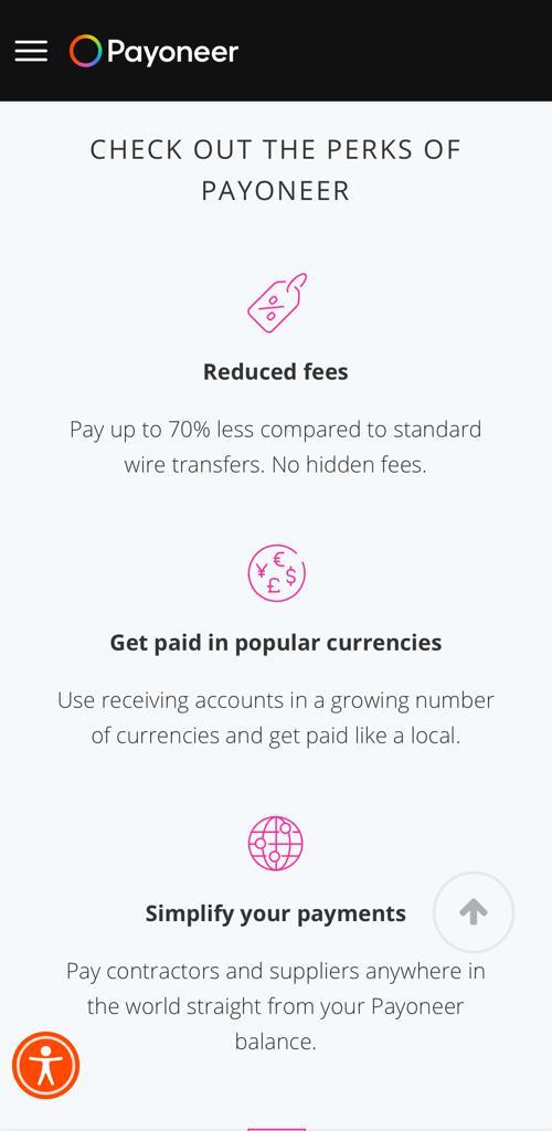
Payoneer
payoneer.com

The Payoneer page brings all the attention to it's center. The alignment creates enough white space around the text and the content
so that the eyes of the customer goes straight to the main content. It gives balance and proper proportions to the webpage.
